
Years ago I watched Bob Ross paint on PBS. He made it look so easy that I felt that I could actually do it. Unfortunately the supplies were not in my price range, especially since you needed a standing easel and those were really expensive.
Years later I saw Donna Dewberry and her One Stroke Painting technique. I was able to obtain her recommended supplies because they were much more frugal. Although I didn’t do a lot with it because she mostly showed painting on things instead of paper. I wasn’t very creative back then and didn’t think to just do the painting on paper, except for some practicing. 
Recently Tiffany and I have seen several people that have done paintings following Bob Ross Tutorials. I thought I might attempt it too. I found an incredible deal on ebay for one of his sets and it looked like I was going to win the bid and at the last second I was outbid from out of nowhere. (I learned a lot about ebay and bids from that one I can assure you.) So I decided that maybe I could find another way to try it.
Apple Barrel paints are MUCH cheaper than oil paints but they are acrylic paints. Donna used Folk Art paints but I used some Apple Barrel ones when I did One Stroke Painting. So I decided to see if I could find the right colors to match Bob’s. I found this webpage that has the hex color codes, I figured it would be the best way to try to match the colors without actually having a sample of them.
Here is what I decided on . . .
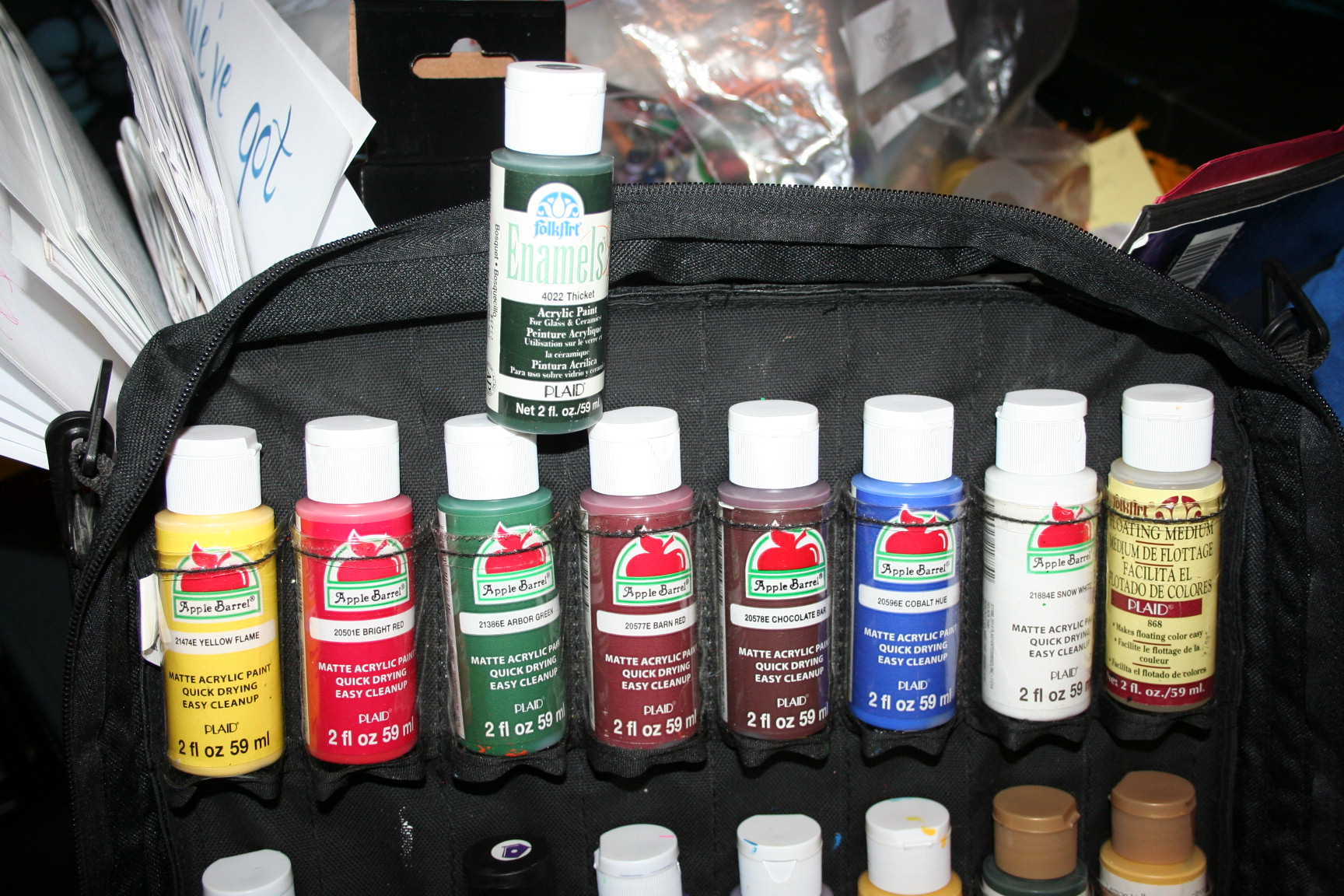 I actually forgot Phthalo green, so I used my Folk Art Thicket in its place. It’s darker than the sap green for which I picked Arbor Green so it added some contrast but phthalo green seems to have a bit more blue in it. I’ll try to pick one up this week when we go into town.
I think most of the colors are a bit off but it’s good enough for learning. The bottle on the end is the floating medium that I learned to use with One Stroke Painting. It helps thin out the paint a bit and get it to glide on the project a bit easier.
I bought some mixed media paper to practice on but it is very dry and my paint did not go on very smoothly. I’ll talk more about that in a moment. I think the paper I got was 11×17 whereas the canvases that he uses are like 18×24 or more. He uses a big 2.5″ natural bristle brush but since my “canvas” is so much smaller, I decided that I would try using just a 1″ brush. Unfortunately my brush is not a natural hair brush. I may end up getting some other brushes later. I do have quite a few One Stroke brushes, so I’m trying to use what I have–I just didn’t have a one inch brush or bigger.
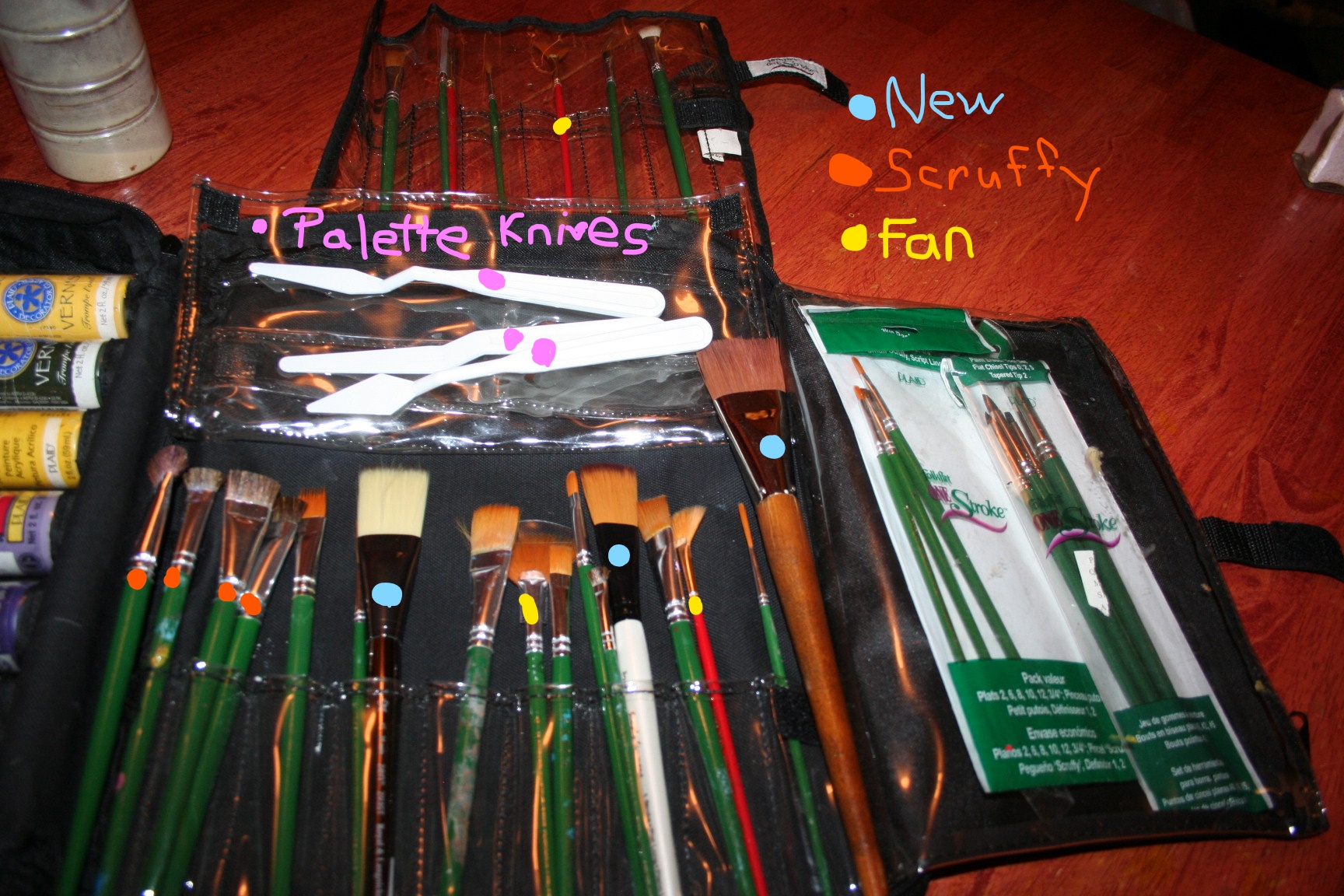
I found Bob’s painting tutorials on youtube for free. I decided to start at the beginning and work my way through them. I’ll post more as I get my supplies figured out better. This time I made do with some cheap little palette knives that really were not up to the task. I’ll be picking up a real one this week, as I know he uses it a lot and I do not like how mine handled. 
I found that my One Stroke scruffy brush worked better for adding in some of the foliage than the one inch brush, which had a bit too much flexibility to it. When I went to take this picture I found that I have a smaller sized scruffy brush too, which will come in handy I think. I also liked using my fan brush for adding some of the highlighted “leaves”. I used the smaller, red handled one, but realized that I have a larger one as well.
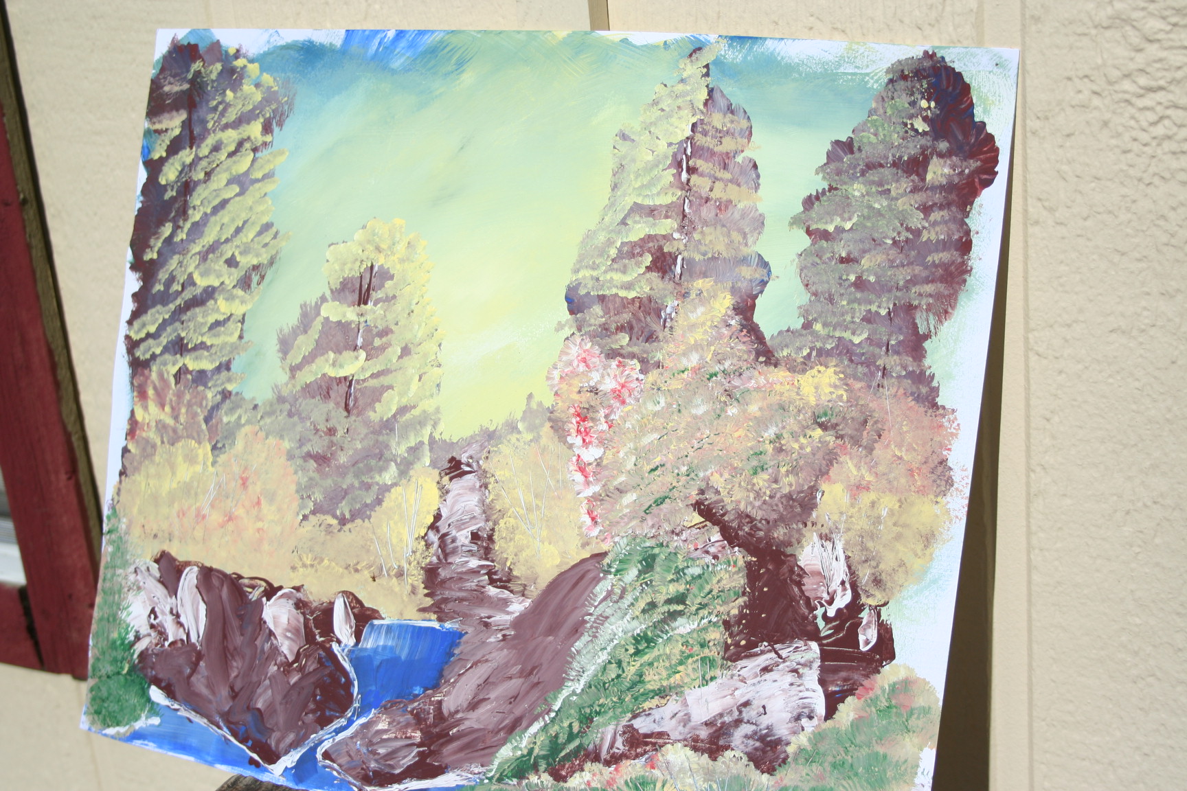
 Well, I guess it is time to show you my first attempt with make-shift equipment.
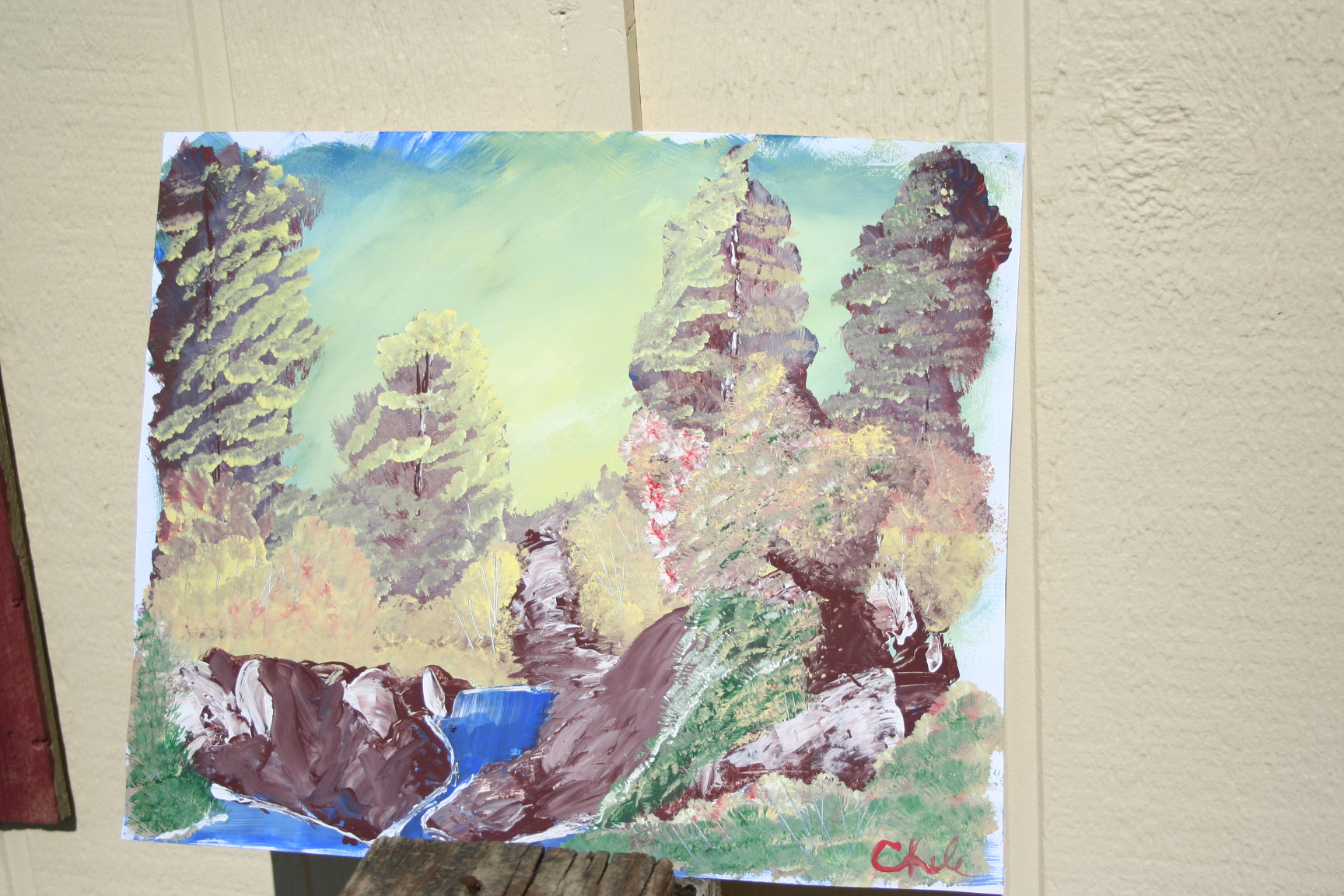 The third tree was the first done and thus the highlight messiness as I was just learning to use the brush. The rocks/dirt up front was another mess because of the improper palette knife. At the end I went back in and smoothed out some of the paint making it more like large rocks or dirt piles.
The tree in the front had its issues as well. That same palette knife was used and I ended up making a much larger tree with way too muddy for the initial leaves and thus the highlight is not seen as easily. To cover up more of the palette knife struggles, I added some greenery in the front with the fan brush.
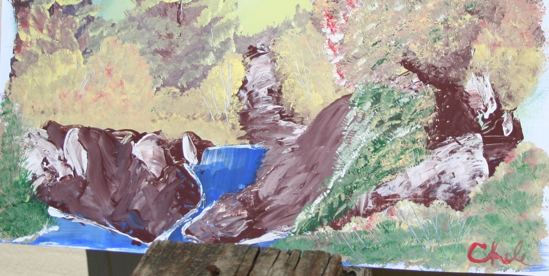
Now, I will have to admit that I loved the “sticks” that were scraped in throughout the painting. It truly does add a lot of depth. If you look closely, you can just barely see them.
 So, overall, not horrible and cringe worthy.
  But definitely a learning experience. Here it is from a slight angle, which I think makes it look a bit better.
 To begin the painting, I mixed a bit of the floating medium with the white and brushed it all around, like Bob did. But mine, since it was acrylic, seemed to dry a lot faster than his oils did, which is how I think it is supposed to work. But I’m wondering if I should just spritz my paper with water or put more floating medium on or what. If you have any ideas, please share them in the comments below.
I just laid this paper down flat on the table and since it is just paper, it kept moving around on me as I was coating it and getting the initial background painted in. I’ve put an adjustable (and easily transportable) easel on my Christmas wish list this year. I’ll just have to figure out how to put my paper on it–maybe with a board and clips?
One other reason I’m trying to use acrylics instead of oils is because they clean with water instead of thinner, so it’s much cheaper and smells a lot better.
Well, that’s it for me today. Until next time,
MicheleºÜº
How cool! I’m going to have to get some paints and give it a try. I love Bob Ross and his happy little trees.
Let me know, I’d love to see your work!!!